Groupieees

Groupieees

Monday 12 April 2010

Evaluation Question 1(Part 1) 1. In what ways does your media product use, develop or challenge forms and conventions of real media products?


- To enlarge images click on them.


• Narrative (how have you established a plot?)

This is an image of the opening sequence from the ‘Matrix’. I believe this image displays the narrative of the film by appearing very cyber. The image displays how the film exits the real world and accesses another, from within the virtual world. This allows the audience to establish a plot, by assuming the film has something to do with another world or people accessing one, from within the technology we use every day. The image involves the audience by appearing to invite or almost consume them into the cyber world of the film.


· Genre

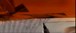
Genre within a thriller is conveyed through use of typical conventions, such as blood. However the genre of this particular thriller is revealed with use of conventions but also by exaggerating, and warping them. The photo displays how the genre is portrayed with the use of red to highlight themes of murder, danger and so on. But then the use of and everyday object such as a pen to paper, suggests calculation and character profile. The merging of shots creates mystery as well as anticipation, but the constant use of weird imaging and disturbing shots, allows the viewers to assume the genre of –Thriller.


· Camera, angle, shot movement and position

This is a close-up shot of a character within the opening sequence of ‘Gothika’. This close-up shot oozes emotion from the character. Showing her to be very disturbed and distraught, for reasons we the audience are unaware. The position is slightly off, which highlights the frantic movement of the character, but also suggest her mind state and, emotional state to be, confused and in a frenzy, which is therefore mimicked by the camera movement. Similarly within our film we used close-up's heavily. In order to display character personality and emotion.


· Continuity & editing

Continuity on screen is shown by the use of continuous effects and colours. The editing used within ‘Terminator Salvation’, Opening sequence demonstrates, a murky and dreary atmosphere. This is continuous. Effectively maintaining a particular atmosphere on the screen and perhaps representing the setting or atmosphere within the film, to be dreary and unwelcoming. The continuity of the monochrome filter, in our film achieves a similar result, as it presents a mysterious atmosphere.


· Sound

The sound in the beginning of ‘The Matrix’, immediately gives hints to the narrative of the film. Rather then music the directors have chosen to use a voice over, in which two characters seem to be conversing on the phone. One character say’s, ”were guna kill him you know, what do you see in him”, the other replies” Don’t be like that, Morphius seems to believe he is the chosen one”. At this point the audience are witness to information that can allow them to assume plots, or the narrative of the film. This is a good effect as it ultimately involves the audience whilst, creating mystery to what the characters are talking about. A common component of Thrillers is mystery, and suspense, and this is exactly what is being created, by the use of a voice over. This is similar to our film, of which we used the same component to create the same effect, just at the end of the sequence.


· Mise-en-scene/ expressionism (lighting; colour)

This image is a great example of the mise-en-scene, within a single shot. The lighting within the frame is very low, key with the television acting as the filler light. This creates a somber mood, which reinforces the emotion shown on the characters face. The character is in costume that is almost, camouflaging her. This shows that she is not of any more importance then the set, shows her to be inferior, as she becomes part of the furnishings. Her costume also resembles a uniform, which allows the audience to assume she is part of something/or some organization maybe, as uniform represents purpose. However the use of glass creates a confined setting of which it seems our character wishes to break free of. This is reinforced by the powerful hand on glass and emotive expression shown on her face. The use of glass also, adds to our audience being able to build up a plot, and allows us to suggest she is in fact a prisoner.


· Typography

The typography used within ‘Seven’ is very interesting, as it is over layed by other text, shifted, and the sized is adjusted various times. This image is of the brightest/boldest time the title was shown. However the title was only shown like this for a very brief time. This typography is plain and simple, but holds something behind it. The time signiture suggests that it is not that important but a simple component of the opening sequence. But the fact it is repeated various times and in various ways, shows that it holds some significance and that the directors want it to be engraved in our minds. The text is also very menacing, as it is slightly scratched into. This mimics some of the actions within the sequence, which reinforces the eerie atmosphere created.


· Iconography

I have chosen to show the use of a gun as a key icon. Within the opening sequence of ‘Saw’ , the icon of a gun displays the narrative and theme within the film. As a gun represents, murder, danger and destruction. This is an open implication of what the film may be about.


· Enigma code

The enigma code is kept within the opening of ‘James Bond –Golden Eye’. As the famous gun cockpit is used to introduce the film. This is an intricate image, and allows the audience to suggest what themes the film may hold. However it in no way suggests the narrative as, this image is very simple!

Wednesday 7 April 2010

Evaluation Question 1 (Part 2)


1: - Camera Shots/Editing
The image is of a close-up of Anisha. The various close-up shots were sliced and edited together.They become a montage of close-up's that make up a frame. This particular frame develops conventions of a Thriller by creating mystery. As the purpose of this footage seems fairly personal and pointless, leading the audience to question, why it has been taken, or who has taken it?

2; -Font/Style &Effect.
The font is fairly plain, and not too exaggerated. This complies with modern day Thriller conventions. As they are normally not exaggerated in font style. The colour represents themes associated with the Thrillers as well as associated themes of Red. Which are danger, Love, Blood and passion, which are openly used within Thrillers also. Which creates a link in the viewers mind of the type of genre and it's associating themes. The effect is 'evaporate', which is the primary concentration, as it reinforces the initial assumptions being made of the genre through font/style, and compliments them.

3:-How the opening introduces the genre.
This image displays, the character having a psychotic break down whilst pining over images of her friend. This image conveys the characters anger and passion. The breakdown , highlights the purpose for the strange behaviour previously. This reverts the common characteristics of a thriller, by focusing on a mental state rather then a murderous vendetta. However the Red filter illuminates the type of genre this film is placed in and compliments the mood of the character.

4:- How the characters are introduced.
The characters are introduced through use of effect. We used templates of polaroid images to portray the relationship between them and highlight the behaviour of one of the friends. The polaroids also create a link with our target audience as they too take many pictures with friends, being young adults. This is an unusual introduction method, not commonly used in films.

5:- Costume&Makeup.
The character is wearing normal teenage costume. A cardigan, graphic t-shirt and leggins. This is character and audience appropriate.As our character is a representation of our target market, of young adults. Her costume mimics the audience. This would be seen in Films worldwide as uniform/ costume represents purpose and character.

6:- Location/Setting.
This image shows our location perfectly. The location seen is fairly desolate, but modern. This type of location is common within thrillers, as the location has to compliment the character lifestyle and film plot.Our location is a good example, as it enhances the affect of the mysterious character behaviour in the audiences mind.

7: -Effects.
The main effect on our film is the Red Filter. This is seen throughout the last scene in our film. This effect was used to enhance the effect of the character behaviour as well as maintain a link with our theme and the continuous use of red within the film. As we want our audience to be constantly reminded/pondering the themes associated with red and the relevance of them to our film. This is a unique effect, as it is not used frequently within films. Some films use it very briefly to represent blood, and reinforce the atmosphere they are trying to create.

8: - How the story is introduced.
This image presents how our story unfolds. The audience by this point would of been putting clues together, by considering the use of polaroid's and previous footage. You would be able to create an assumption of plots with this image.You can see that the character is behaving sly, and following somebody. This allows our audience to assume she must have feelings of some sort, that lead to her following her friend.

9:- The films title.
The films title reflects the primary themes of the film and also the genre. A twisted Obsession produces a hint of the plot in the viewers mind, especially appearing after footage that introduces the characters, their relationship and the film genre. Considering this our film title uses the conventions of a Thriller, as it is important that the enigma code is kept intact, but some of the plot is revealed in order for the audience to feel involved and to continue watching comfortably.

Evaluation Question 2 -2. How does your media product represent particular social groups?

Evaluation Question 3

What kind of media institution might distribute your media product and why?

Evaluation Question 4

-Evaluation Question 4-Press Full to see Document entirely and to scroll down.

- Sample Questionnaire.

Tuesday 6 April 2010

Evaluation Question 5 - How did you Address/Attract you're audience

Evaluation Question 6


Adobe Photoshop:

We used photoshop to import the original image of my lips and work on it, to create the production Logo.

Pro’s: - Adobe Photoshop is a very creative piece of technology. There was a lot of tools and effects available for us to use. It is easy to import images and build upon them using layers and the effects. There are also tutorials available, that taught us how to try out and use different effects. We learn't how to apply effects to a photo and create a production logo.

Con’s: -Photoshop isn’t easy and is very hard to get used to. It took a while to get used to and was very time consuming.

Adobe Premier Pro: This software was used to import our entire film with the soundtrack and our title sequence.

Pro’s; -Premier pro was very good. You could import the video easily and put it in the format needed to access the video in the U.K . The tools were easy to use, such as cut and merge. We used this software the most to actually finalize the film, and rough cut. It was easy to import the production logo and animation applied into blank frame, and them adapt them to our liking. We learn't how to edit, cut and merge film shots together to create on shot. We also learn't how to import title frames and animation into frames.

Con’s: -Merging the soundtrack with the video proved very difficult as we had to un link and then re link. It was a very taxing process. Also the software was only at school so our time became limited.

Adobe Aftereffects: This software was used to create the animation for our text sequence and our animated logo.

Pro’s; -After Effects had loads of effects available and we found it easy applying them once we learnt how , and importing them back into Premier Pro. We learn't how to use effects layer and apply them to titles and credits and also animate our logo using anchor lines.

Con’s:- It took a few tutorials and a while to get used to using all the effects.

Facebook: This popular communication site, was used very frequently when we weren’t together at school we communicated.

Pro’s; - Facebook is great, we were able to talk to each other instantly and plan what would happen in following meetings. We also swapped idea’s on effects and caught up on the research we each were doing. We could easily leave each other a message if we needed to get a hold of one and other. It was used frequently to catch up on production and just plan.

Google: We conducted research using Google.

Pro’s; - Google was very helpful. Everything I needed to know was available. This helped me to research into music, other films and programmes and software that I had to use.

Con’s: - As information can be added freely by anyone, I had to use various sources, as it was not always reliable information or up to date.

Itunes: This programme was used to import and export music.

Pro’s: -It is easily accessible as I have it at home. It also supports various media formats which was helpful.

Blogger: This webpage was used to import all our coursework on to, and import images and links etc.

Pro’s: - This was the most used website. It was very easy to embed videos, import music on to. I also found it helpful to use different presentation affects such as slides on to it, to present my coursework. I could easily edit blogs and customize my page so it felt like mine.

mediaconverter - is the website I used to convert and import music into and also films, to a format that Blogger could recognise and support.

Pro’s: - This is one of the only free converter websites. It was very easy to access as well as place links into it so that I could convert music or video’s.

Con’s: - There was only a set amount of MB’s allowed to be used a day. Sometimes the converter was unreliable and would cancel, other times it took almost an hour to convert a products.

HD video recorder & Tripod: - Camera that we used to film the whole film. Tripod Held the camera in certain shots.

Pro’s: - The video recorder was very easy to use, and up to date. There was optical and manual zoom, which we used a lot to get the blurry effect in many shots. This camera could also be stabilized easily for the frames to have less shake, where wanted. We also recorded our voice over using this, which was really easy. We were also able to switch from video to it being a camera. This was used to take images for the location. We used the tripod to steady the camera, securely whilst we took images and also within certain shots(The bathroom scene). This worked really well as we achieved very clear imaging and it was easy to use. I learn't how to direct and shoot a film. To collaborate frames and test lighting. I also learn't how to use camera angles and techniques effectively to get great shots and get a story across.

Con’s; -There were only set periods/times we could use the camera which rushed our production process.

Evaluation Question 7


Looking back at your preliminary task- To see document clearly click Full
View more documents from guestaad1bad.

FINAL FILM !!!!

A twisted obsession from Jemma Goulds on Vimeo.

Meeting 12

We had finally Made the amendments and edited all we needed to. We used Adobe Premier Pro to import and watch our final film! Whoop = ]

Friday 2 April 2010

'Twisted Obsession' -Poster


I created this film poster as a sort of advertisement for our film. This would be done in the filming industry to promote a film. However the poster i have created is very unique from those up on bill boards. Normally the whole film poster would be fairly dramatic and graphically overwhelmed, whilst i have created a poster with a more neutral/natural essence.

By using Glogster i was able to import image and then frame them, once this was done i then fade and gave them softer edges so that they blended in with the background and also gave a mysterious effect. The word processed images i created my self by downloading and editing fonts,colour size and opacity. Once i had done this i simple converted the word processed product into a Jpeg which could be recognised by the Glogster software format. The graphics seen on the poster are provided by glogster and i just placed them where i though appropriate. I was very careful not to overwhelm the poster, but i wanted to incorporate our Themes of Love and Obsession. to achieve this i stuck with the theme we have running of Red an Black and used the colours accordingly. The only problem is that i have not shown an amazing amount of consistency. I say this as i have not used the font , my group have used within the title sequence. Reason for this is , that the font was exclusive to Adobe and could not be used on Glogster nor in Word.
By overlapping and seemingly pinning down imaged and placing scratches and blood splurges onto them i hoped to give that obsessive and possessive feeling across. I believe this poster would appeal to many teenagers as many keep , a scrap book or photo album of friends. I wanted the poster to look more like a scrap book as within the Synopsis of the film you will see that the obsessed character keeps a scrap book of her freinds possessions and images of her also. I though this would immediately create a clear link to the film and it's content. However as this would be the first thing and audience would see they wouldn't know! For this matter i wanted to keep the enigma code, this poster is intriguing and appealing but very mysterious as you would not know what the film was about. Although there are a few clues hidden in the text- that hint it may have something to do with revenge or love. And the sentence -" I want you" suggests it may be a horror as it is so very abrupt. The images Suggest friendship , but i was careful in how i placed the images and the images used, as they all show Anisha to be Rihams center of attention. These elements in place i would hope that the narrative of the film would not be revealed to much, but that the clues on the poster would allure the audience and them want to piece the clues together.


Thursday 1 April 2010

Preliminary Task - 'OWT' && Evaluation

AS Preliminary Task Group 1 from Jemma Goulds on Vimeo.


Rough Cut and Feedback


Feedback -

- 'i liked it but i think you should add a shot of Leanne following Toni to make sure the storyline is clear'
- 'good, intense soundtrack'
- 'your titles need to appear slower so they are readable'
- 'wicked'
-'very good but you need to make the storyline more obvious'
- 'the soundtrack should drop in time with Leanne when shes having her breakdown'
'maybe the happy shots of Toni should be in colour'
- 'some shots are very blurry and shakey'

Changes ; -

By getting the feedback we knew we had to make the plot clearer. We then went out of school and filmed a shot of Leanne following Toni. We used various camera shots. Including, over the shoulder and Match on action. We thought this shot would display Toni’s cluelessness to Leannes habits, which would allow our audience to establish character behavior and personality.

As we wanted to previously but didn’t know how it would effect the film, we went ahead and changed to whole colour of the last frame. We used a red tint filter, from Adobe After Effects. This scene was very important as, it is were the audience experience Leannes breakdown, We wanted to keep the theme of red, as it connotes , danger as well as love. We also believed this made the whole frame look mysterious and more effective as it played as a sort of insight to her mind.

As our titles had sped up for some reason in our Audience testing, we learnt how to slow them down so they were legible. We kept the effect as we thought it heightened the atmosphere and represented our genre well. We added the final touch of the polaroid’s that I had been editing and trying out. These entered in the titles and showed images of Leanne and Toni, which we hoped allowed the audience to identify the relationship between the character and who they were.

We adapted and edited the soundtrack so that it flowed better and it ended up having a much better impact on the film. Although the audience had commented on the blurry effect we, personally agreed that it added something to the film and was and effect worth keeping. It may of shown the characters mindset as blurry and confused. It was a brilliant mistake that led to there being more mystery and anonymity on the screen.

We finally added the voice over once performing many tryouts with us each. The sentence in itself, wraps up the whole film and also reveals the reasoning behind the behavior of the character in previous shots. We thought this was very engaging and compliments the content and effects of the last frame.

Meeting 11

We needed to produce a rough cut in order for us to test our film with a live audince. As we had already been editing and working on the film, we produced a good rough cut. Their were some problems with our film that we knew we had to change and improve. We produced this rough cut to an audience and got some very good feedback. This feedback helped us decide what we should change to make our film look more professional.

From getting the feedback, i then filmed new shots of Anisha and Riham to put into the film. we found that these shots in particular would allow our plot to seem more interesting and understandable.


Edit/ Effect Possibilities


Within our title shots we wanted to incorporate an effect that would highlight certain aspects of the films. I came up with the idea that we should incorporate Polaroid frames or memobelia relating to girls in some of the blacked out title frames.
The Polaroid's we all though would be a great relation to much of the action within the screen, as our main protagonist was obsessed with her friend and continued to take pictures of her. i believed this would tie in with the ending shot. When Leanne turns crazy a starts ripping to shreds the images she had previously taken on Toni.

We began thinking of ways we could incorporate this cleverly, and as we had been using Adobe After Effects quite often we felt the animation process that we had used for the Production logo would be great however we didn't know if it would work very well.

I had found an image that became a great inspiration for us, as it was very clever as well as creepy. we knew we could not create something as creative as it as we did not have the time, nor the expertise. However we begun to work on parts of it just to see how and if we could incorporate even a part of it, or just the idea into our opening sequence.

-The original Image

From this original image we took our images, i had taken and put them into space we thought appropriate. To create a neat edge in our images which i placed into areas, we put a soft edge blur on the edges. however in certain areas you could still see the image underneath, which i knew ,we didn't want at all. I came to the realisation that this would not work as I would have to construct an image from scratch and have the right software to achieve this. All was not lost. when i had shown the image to the group, we gained a lot of inspiration and came up with another effect idea.
- An image which i implemented in the montage.


- The Montage try out.

From creating this montage we collectively thought of how to input a polaroid image cleverly into our title sequence. I then found a blank template and decided the same way in which imported images in before it could be done again. This time it would work effectively as there would be no image behind. Another positive was that our images we had taken would be able to be seen clearly and largely.

- The blank Polaroid frame

- The Final Polaroid Tester.


In completing the tester i knew we had a great effect, my only problem was that what if this effect would overwhelm the screen and take away from the simpleness of our title frames. Another problem would be if it took away from the screen and may of looked very tacky and the audience then wouldn't concentrate on the titles and credits at all. These were constraints of using this particular effect. Once showing it and talking to the groups we decided that we had a lot to already amend and from getting our rough cut feedback we had things to change and input already. Once we had made the amendments of reshooting certain parts and adding in extra shots, we referred back to the credits. Each of us liked this effect and we saw that using the Adobe suite we could adapt it to suit us. So we used the effect, placed various images onto it concerning which frame it was and also used it to introduce the credit titles. Overall it ended up being a great idea